Typography is the art and technique of arranging type to make written language legible, readable, and appealing when displayed. The arrangement of type involves selecting typefaces, point size, line length, line-spacing (leading), letter-spacing (tracking), and adjusting the space within letters pairs (kerning).
Type design is a closely related craft, sometimes considered part of typography; most typographers do not design typefaces, and some typeface designers do not consider themselves typographers.
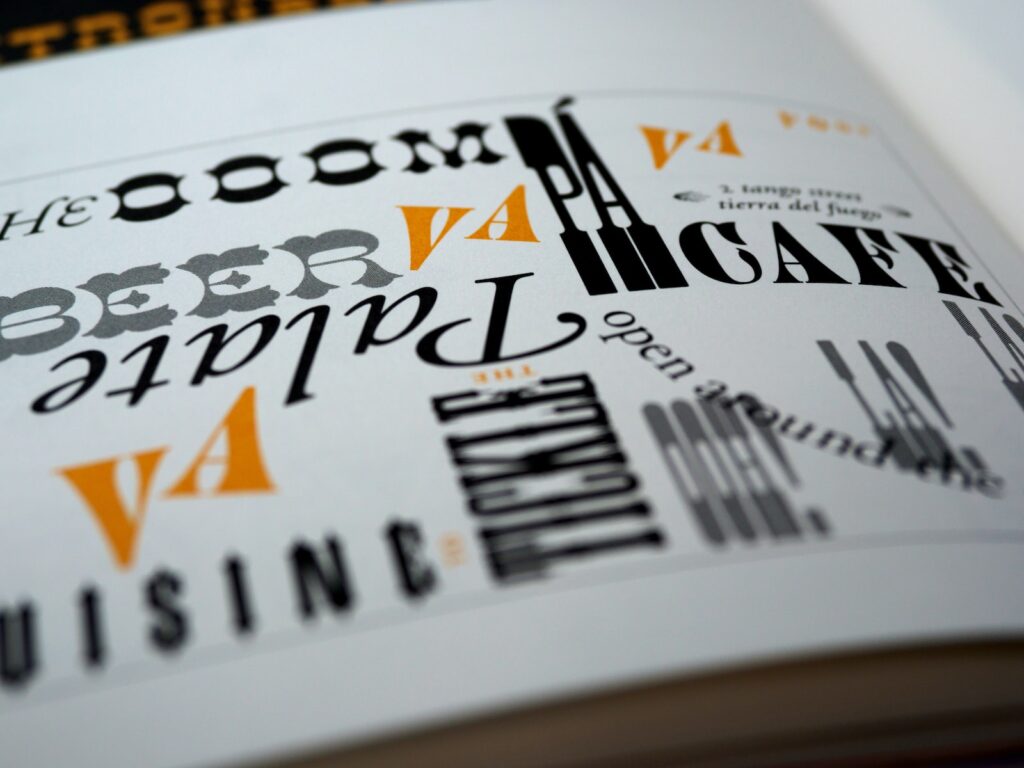
Typography In Modern Times
In modern times, typography has been put into electronic form with computerized typesetting equipment. However, hand composition using metal type is still widely practiced in small shops and by hobbyists.
The role of typography in branding should not be underestimated. Typography is one of the most important tools in a marketer’s toolkit, and it can play a pivotal role in how a brand is perceived.
When used effectively, typography can convey a brand’s personality and values, and create an emotional connection with consumers. It can also be used to establish a visual hierarchy that makes it easy for consumers to navigate a brand’s website or other marketing materials.
However, when typography is used poorly, it can damage a brand’s reputation and make it difficult for consumers to connect with the company. That’s why it’s so important for marketers to understand the basics of typography and how to use it effectively in their branding efforts.
Tips For Better Typography
The following are some tips on how to use typography effectively in branding:
When it comes to typography, there are a few key things you can do to make sure your text is easy to read and looks great. First, use a legible font size – large enough that it’s easy to read but not so large that it’s cumbersome.
Second, use short lines of text – around 50-60 characters per line is ideal. This makes it easier for the reader to scan the text and find their place if they need to stop reading for a moment.
Third, create contrast between the text and the background. A light-colored font on a dark background or vice versa is usually easiest to read. Fourth, add space between the lines of text – 1.5 or double spacing is usually best. This gives the reader’s eyes a break and makes it easier to follow the text.
Fifth, justify the text to create even margins. This creates a tidy look and makes the text align neatly with any other elements on the page.
Sixth, use italics or bold sparingly to emphasize important words. Too much of either can be distracting and difficult to read. Seventh, keep the overall design simple. Clutter can be overwhelming and make it hard to focus on the text.
Eighth, use hyphens and dashes judiciously to break up long words. This helps to keep the text readable and prevents awkward line breaks. Ninth, avoid using all caps as it can be difficult to read. All caps can also be seen as shouty or aggressive, so use them sparingly.
Finally, tenth, use quotation marks, ellipses, and other typographic marks appropriately. These can add visual interest and emphasis, but again, too much of either can be distracting. By following these tips, you can create beautiful, easy-to-read text that will make a great impression on your readers.